Recent projects we've poured our into


Mark Bunn’s brand was one of the most challenging, yet rewarding, projects we’ve worked on to date. With Mark we honed his positioning, messaging and core topic areas, while creating a bold, professional, and highly visual brand that evokes the feeling of stress-free happiness he’d like to see us all achieve. In addition to the brand positioning, look & feel and website, we also created a ‘speaker kit’, an engaging, highly visual marketing resource to help Mark’s team and bureaus to on-sell him as a speaker, and art-directed his video showreel.
As a professional speaker, Geoff Knight had an amazing story to tell, but in following the drive that saw him escape a life of crime to become a celebrated New Zealand actor, opera singer and speaker, he wanted to achieve more. Through a series of intensive workshops, we developed a new take on Geoff’s mission in life, developing both his speaking brand and a new suite of topics that challenge the corporate culture status quo. In addition to creating and executing his brand, website, speaker topics, and speaking materials, we also produced his speaker showreel and directed his photoshoot.

Our rebranding of Green Real Estate Agency created a prestige positioning with an aligned employer brand and overcame a disconnect with their perception in the market. It's helped defuse pushback on costs by demonstrating value and created a stylish, flexible brand that's easily reproduced across a vast array of print material whilst simultaneously constraining costs. We re-wrote the book on real estate imagery and built a bespoke online portal that conveys the feeling of a magazine spread.
O’Briens Window Cleaning engaged us to create a dynamic logo and supporting brand look and feel for the launch of their commercial window cleaning business. We rolled the brand out across all touchpoints, including business cards, stationery, social media, signage, ute wraps, uniforms, original website and capabilities statement. We continue to work with O'Briens on an ongoing basis, assisting with proposals and other design requirements.
When the Australian Head of Army needs a leadership guru, he calls Avril Henry. Straightforward and direct, Avril’s new brand reflects her transition to a larger business scope and an increasing demand for her keynotes and leadership development consultancy. With a particular affinity for orange and triangles, we transformed Avril Henry into Avril Henry and Associates, providing a powerful online presence with flexible eCommerce options for book sales and event bookings.
Economist Stephen Koukoulas is a down to earth, ’say it how it is’ sort of a dude. Moving into the speaking space Stephen needed a brand presence aligned to the quirky persona developed in his role as an economist with a strong media presence. Embracing his whimsical Twitter handle, “The Kouk”, we pushed for this identity to be the touchstone of his new brand and created an online presence that catered to his prolific writing across his own site and social media.
Adam came to us with a unique vision for bringing the Sydney urban street life to light in a way rarely seen before. His particular talent for discerning the abstract, and the essence, of structures and locations is as unusual as the city itself. Seeing a market for images of this genre, we worked with Adam to create a brand for his photography, and a site, brochures and other collateral to help showcase it to the world.

Founded by Sam and Kate Cawthorn, Caring for People is an australian based charity committed to empowering, educating and assisting small communities throughout India.
An inspired not-for-profit operation, Caring for People needed an engaging brand look and feel (that didn’t break the bank) that was inviting and informative, reflecting the hands on authenticity and hope it inspires. The project showcases Caring for People’s impact and ultimately helps people get on board to assist both locally and internationally.

Redbank School exists to support students who present with complex, diverse and dynamic needs.
This brand was designed to diffuse the stigma attached to mental health challenges by crafting a narrative and visual expression that meaningfully aligned to the deeper purpose (not the circumstance), and powerfully articulated values that reflected the heart of this incredible school.
The outcome was a brand that was empowering, and that everyone could feel a sense of belonging to.

Histography came to us as a repositioning of an existing web project. The brainchild of Michael McQueen, our work on the Histography site and its products needed to reflect the evolution of the business and the changing demographic of its core audience. Our brief was to create a more contemporary and vibrant look and feel that continued to evoke feelings of nostalgia in its viewers.
For Rozelle Total Health we created a brand that retained the history, holistic and 'homey' (but not hippy!) feel and comfort of the practice, but also increased it's visibility and presence as a general practice. Our logo represents the 12 core practice areas that constitute their approach to total health, for every body - which also informed the tagline. The rings are used as a secondary device and the colours represent the varied practice areas of RTH.

In a suburb known for sophisticated wine and coffee choice, Penny Lane is notable for its unparalleled selection of local and international wines and its take-no-prisoners approach to Italian style espresso. With a menu to match the brand needed to combine the refinement of its menu with the quaint sensibilities of its location and gorgeous courtyard. With regular menu updates, the site needed to provide an easy means for content management across a complex and ever changing range of food and wine.

Speaker’s agency O2 Speakers required a complete rebrand to reflect their expansion into the international speaking market and their repositioning as an exclusive “world class manager of disruptors, thought-leaders and innovators”. Our work on the ODE brand extended into the DNA of the business, helping to create core languaging and ensuring the vision of a beautiful, informative and actionable site was met.

Colin is an unassuming powerhouse of talent. A speaker of enormous presence and rare dynamism, his presentations are punctuated with his signature comedic drawings and backed up by solid research. His brand reflects his affinity with the pen - both in his incredible skill with words and his artistic ability - while still appealing to his predominantly corporate audience.
Kite’s founder, Kiera Kelly is a leader of vision and persistence. Not content with the status quo, Kite represents an entirely new order in the world of digital publishing and our role was to bring the brand to life with vibrant, dynamic imagery and a strong, instantly recognisable brand mark. Within a month of launching, Kite was invited to participate as a world-leading startup in the Las Vegas Collision conference.

A leading researcher, author and speaker in the field of performance, our association with Dr Adam Fraser has extended over half a decade and across multiple book projects. From his personal rebrand as a speaker, author and consultant to book covers, branded models and ongoing website updates, we've assisted Adam and his team across almost every touchpoint of their business.

Jen was engaged to create the logo and brand look and feel for ChangeLabs, an inspired business with a mission to change the world through the design and execution of innovative, large scale behaviour change programs that create positive social impact. The resulting brand, with it’s dynamic paint device and bright colour palette captured the dynamism, creativity and boldness of the brand; the layers of paint ultimately representing their imprint and impact, it builds and changes and is an ever evolving process. Jen rolled the brand out across all touch points and continues to work with the ChangeLabs teams in Australia, the US and NZ on various projects.

A force to be reckoned with in the employer branding space, Kellie Tomney is passionate about assisting teams, organisations and individuals to stand out in their uniqueness creating tangible performance results. Kellie needed a brand that aligned to her authority and expertise in helping organisations to become an employer of choice. We developed a unique, STANDOUT, confident and dynamic brand look and feel that was underpinned by the logo: the “standout stamp of approval”.

Peter Sheahan is one of the world's most recognisable business speakers in the field of behavioural change. Coinciding with the launch of ChangeLabs, his brainchild, we evolved Peter's brand to intrinsically connect with the ChangeLabs brand look and feel, with a twist that differentiated the speaker brand; reflecting the vibrancy and dynamism of Peter's passion and energy as a presenter.
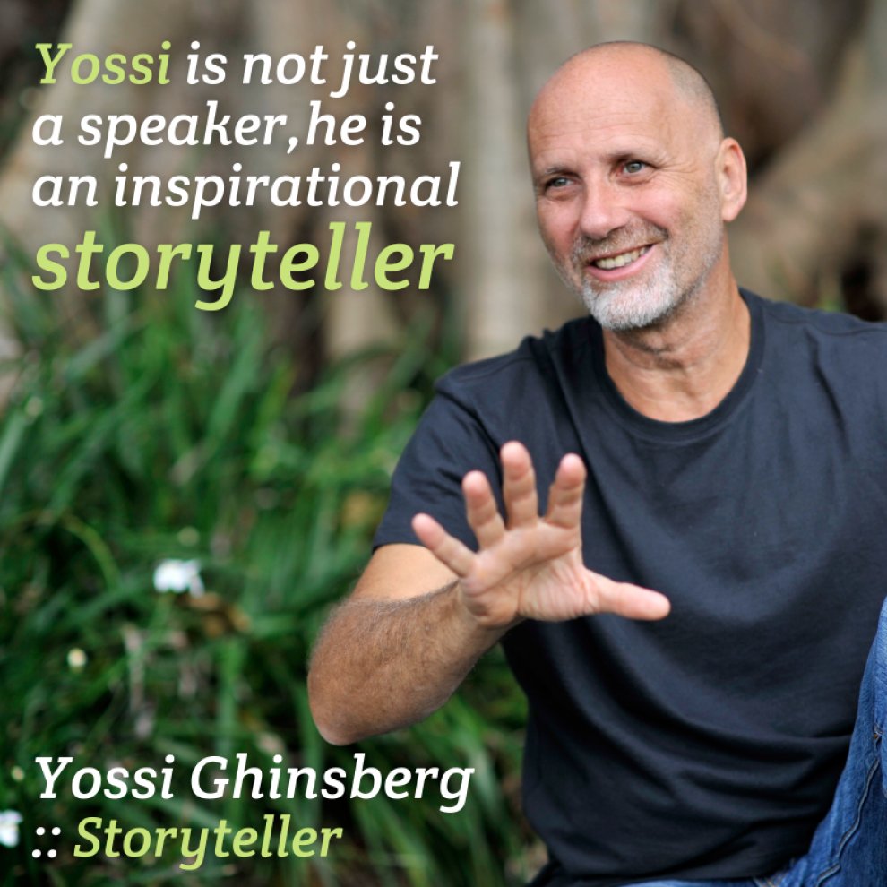
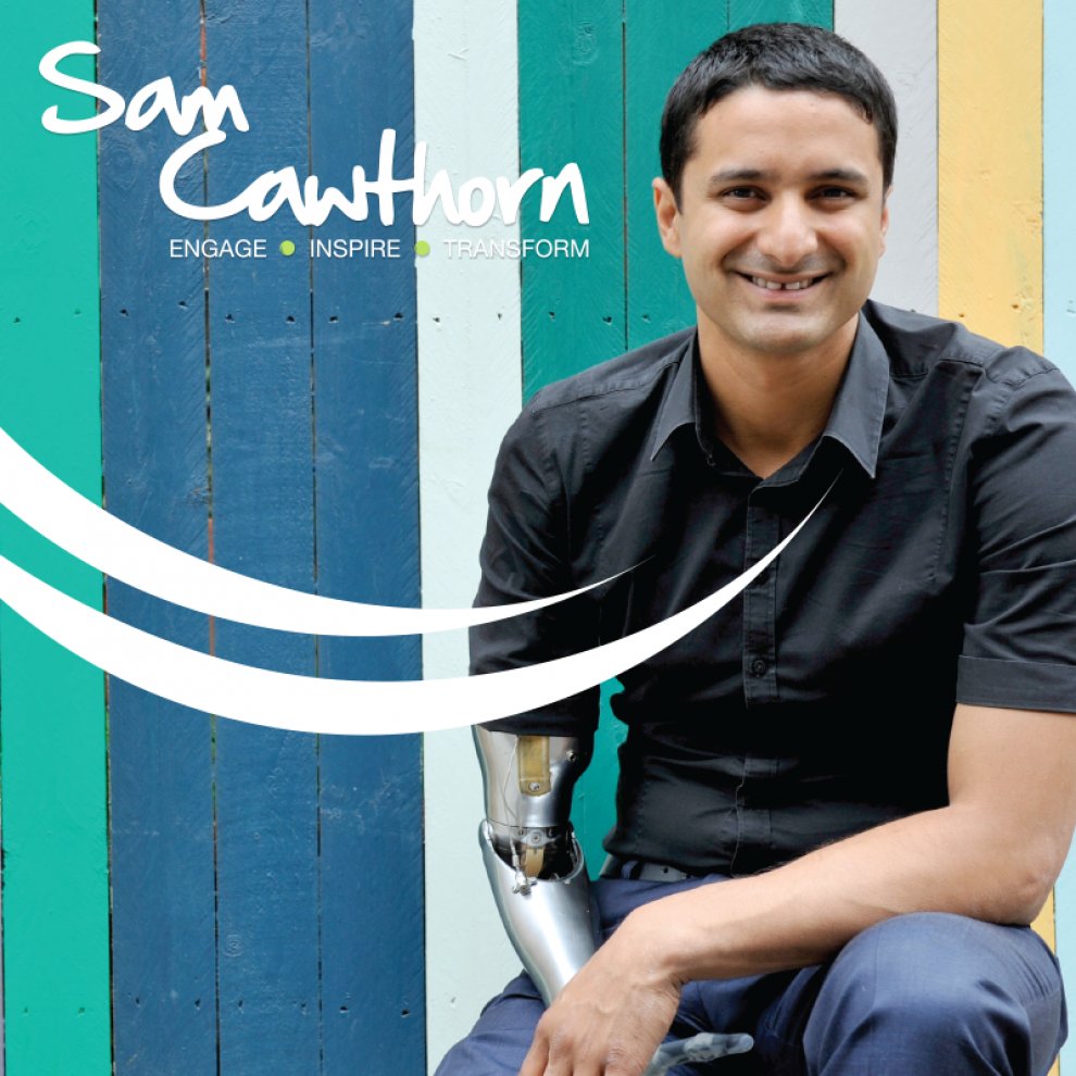
When Sam first began to gain traction as a speaker he came to us to help strengthen his brand look and feel beyond the existing logo, and to design his marketing materials and models for the Bounce Theory. In the years that followed we have continued to consult with Sam, designed several e-books, an entire coffee table book (111 tips), the cover for his bestselling novel Bounce Forward and created logos for several product brands including the Institute for Professional Speakers.
After 25 years, Ovations existing brand no longer reflected the contemporary culture of the business. Known as a progressive force in the Australian speaking industry, CEO Leanne Christie wanted a brand that showcased the energy, passion and fun of Ovations and its staff. Our biggest challenge was to retain the brand equity and history of the big red ‘O’ and create a brand mark that could be used dynamically across a range of modern media.
The House of O is the umbrella under which Australia's most successfull speaker companies operate.
Incorporating speaker agency ODE Management, speaker bureau Ovations! and Standing Ovations speaker coaching, the businesses are the brainchild of speaking industry powerhouse Leanne Christie. Always ahead of the curve in the speaking world, we have been engaged in rebranding existing businesses, branding new ones and assisting with the speaker branding requirements that are our specialty.
Jen was engaged by Future at Work and brand & marketing guru extraordinaire Penny Burke, Director of Essence Communications, to design the visual realisation of the ‘Serious (about) fun' campaign for Toys 'R' Us; an Employer Value Proposition project driven by Penny. Lisa Geyer, the National Marketing manager of Toys ’R’ Us, then engaged Jen to design all materials for the roll out of the EVP and their global management conference. This project marked the beginning of an ongoing relationship between Essence and Jen, since which time they have collaborated on various projects.
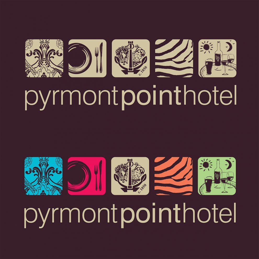
Jen was engaged in 2010 to revamp the brand for this historic hotel in Pyrmont. They wanted to retain the coat of arms of the original logo in the evolved brand (as this is still reflective of the largely unchanged front bar), but also wanted to reflect their various more upmarket and modern rooms and full service restaurant. The result was a logo with 5 icons that represented each area, and a colour system to match. Jen rolled out all the collateral, signage and uniforms.


