Apart from the near-constant societal refrain bemoaning the lack of time, ("where has the year gone?", we ask ourselves) Google Analytics provides the clearest demonstration that our attention is at a premium. This is the very first data you see when looking at all analytics properties at a glance:
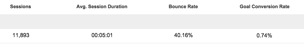
Literally 50% of what Google considers to be the most relevant information is concerned with how long users stay on the site.
If Google thinks it's important, so should you.
Banner blindness has become header blindness
At the birth of advertising on the web, 'display advertising' (i.e. graphic banners at the top, side and bottom of the page) was a big thing. It's still pervasive today, but the click-rate on banner advertising has dropped massively since its inception. We now have 'banner blindness' - we just tune out those shiny little ad boxes.
Hence, massively intrusive 'Look at me!' pop-in ads begging us to sign up for yet another newsletter.
But it's not just advertising we've become blind to. We also don't care about the header of a website:
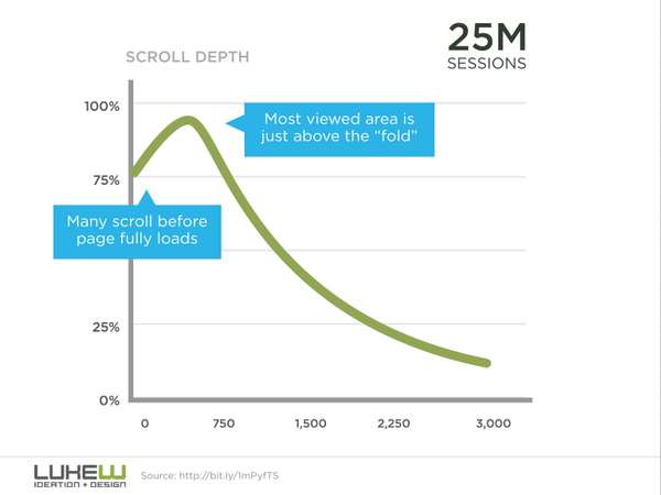
In other words, we've become so used to the header of a website being filled with useless guff that we start scrolling down before the site has even finished loading!
What exactly is it that we're avoiding, and how can we earn back our visitor's attention?
Five things your site can do to regain attention
1) Stop talking about yourself
Seriously. Just stop it.
Users don't care about your past, your future, your hopes and dreams. This is the 'What can you do for me' economy and users won't care about you until you're valuable to them. Put your moving story of personal triumph on the about page - after you've explained to them how your vision helps solve their pain.
For everywhere else, evaluate your site by setting your timer app to 3 seconds and reading what you consider to be the important content areas. If you can't get the gist of content you already know in three seconds, you can be sure that site visitors are hitting the back button.
2) Make the header of every page useful
Users start scrolling past the header before the page finishes loading for a reason - most headers are indulgent and self-serving.
Take a good look at the header of your site and ask yourself if a user could completely understand the intent and purpose behind that page without needing to scroll.
If they couldn't or it's too vague, then it's time for a re-write.
3) Does the page have a call to action?
If the user can't figure out what you want them to do with an easily-identifiable action, then you've just wasted their attention. You won't get it back.
4) Give solutions, don't ask questions
How often do you see a header asking a very obvious question like: "Do YOU want to get more leads?"
Answer: all the damn time.
It's condescending and it's a waste of time - you're effectively repeating back to them the question that brought them to you in the first place.
Stop it.
Just give them the answer: "Get more leads today, by not being a total idiot about your marketing".
It's more engaging, it's to the point and you haven't spent their attention unwisely.
5) Make every email count
If you're going to use email marketing, every email must be of value to your customers, right from the start.
Unless your very first email is immediately fascinating, useful and directly relevant to them, future emails will be consigned to that dusty never-opened folder of unread marketing emails that they can't be bothered unsubscribing from.
We all have just one or two marketing emails we receive each month that we never miss because they're always insanely useful, interesting and valuable personally to you.
Be that email.
You can't refund attention
Once you've lost the user's attention, you'll have a hard time ever gaining it again.
To bring it back to the currency metaphor, if we buy something that doesn't work, doesn't do what it's supposed to or doesn't fit our needs we feel ripped off. We want a refund.
You can't refund somone's attention.
Stop ripping off your user's attention. Spend it wisely and they'll be with you forever.